Web Design Spotlight - Sartorius Massage Therapy
A look back at a website I launched for Sartorius Massage Therapy, a Northborough, Massachusetts practice led by Nick Mulcahy, LMT.
The goal was to translate Nick’s approach into a digital experience that feels calm, intentional, and easy to navigate. The site needed to introduce the practice clearly, communicate what makes Nick’s work distinct, and help prospective clients move from discovery to booking without unnecessary friction.
Translating the practice into a digital experience
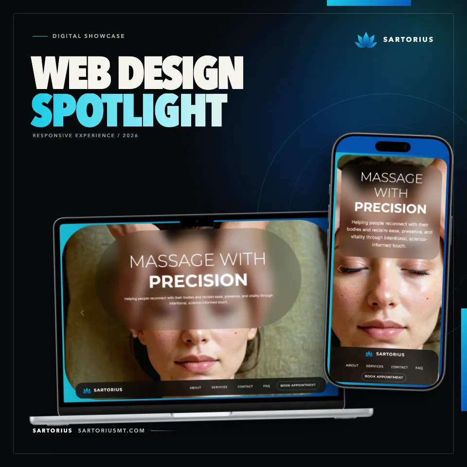
Nick’s work is personalized and science-informed. The website reflects that balance: considered and welcoming, but also precise. The design avoids visual noise so visitors can focus on the practice, understand the available services, and decide whether Sartorius is the right fit for them.
A bold, minimal visual system gives the site its character. Dark smoky backgrounds create focus, while vivid blue accents connect the interface to the Sartorius identity. Clear typography, spacious layouts, and purposeful contrast keep the experience composed and readable.
Creating the complete brand package
The project went beyond the website. I created the complete Sartorius brand package: the color system, typography, tagline, and a flexible logo suite with wordmarks and standalone lotus marks for light, dark, blue, and transparent backgrounds.
The identity is grounded in the meaning behind the business. Sartorius is named for the longest muscle in the human body, giving the brand an anatomy-informed foundation. The lotus adds a second idea: resilience, renewal, and the ability to move through stress toward balance. Together, those references support a practice that combines sports recovery and therapeutic precision with calm, restorative care.
The core palette pairs Sapphire blue and vivid cyan with Eerie Black, then softens the system with pale blue and Platinum neutrals. It can feel energetic when the brighter blues take the lead or quieter and more grounded when the darker tones dominate. Montserrat gives headlines and brand moments a strong, structured presence, while Inter keeps service details and longer copy open and readable.
The tagline brings the strategy into one line: “Massage with Precision, Presence & Purpose.” Precision speaks to anatomy-based, science-informed work; presence reflects attentive, client-centered care; and purpose keeps the experience focused on each client’s goals. The result is a complete identity that feels clear and professional without becoming clinical or cold.
Clear information, purposeful paths
For a service business, strong visual design is only useful when it supports the visitor’s next decision. The Sartorius site is organized around a few essential questions:
- Who is Nick, and how does he approach massage therapy?
- What services are available?
- What can a client expect from the experience?
- How can someone book an appointment?
The content answers those questions in a direct sequence. Visitors can learn about Nick’s personalized approach, review the service information, and reach the booking path without searching through a complicated site structure.
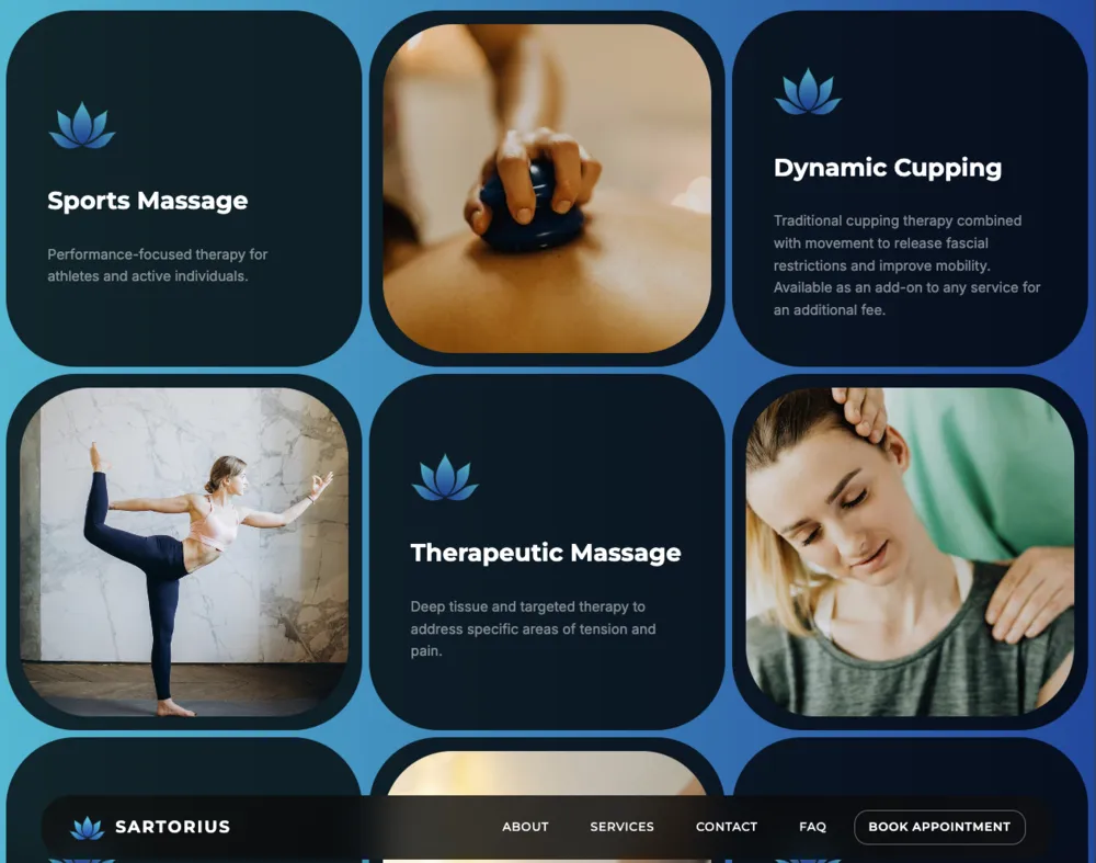
The services section makes the options easy to scan without reducing them to a plain list. Sports Massage, Therapeutic Massage, and Dynamic Cupping are presented in a structured grid that pairs concise descriptions with imagery. The repeating cards create a clear rhythm while the blue gradient and rounded frames keep the section connected to the larger visual system.
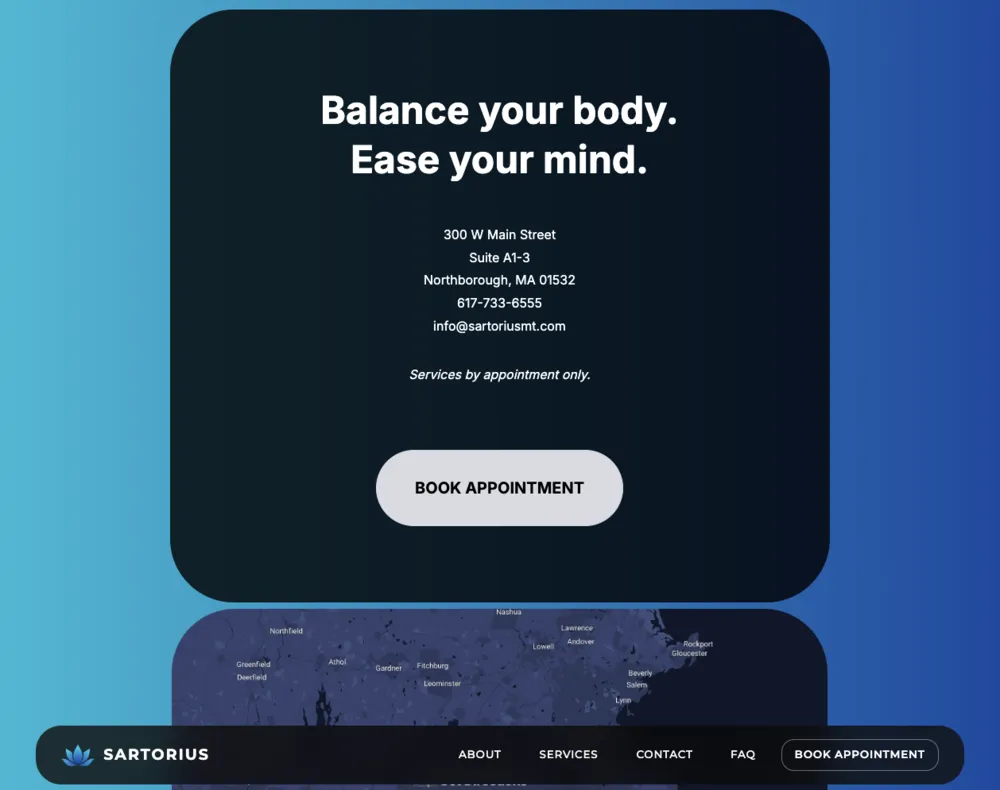
The path ends with a focused call to action. Contact details, the Northborough location, and appointment-only availability appear alongside a prominent booking button, giving visitors the practical information they need at the moment they are ready to act.
Consistent across screens
The visual hierarchy carries from desktop to mobile: the message stays prominent, the navigation remains concise, and the booking action stays easy to find. That consistency matters because a prospective client may first discover the practice on one device and return later on another.
The result is a site that reflects the character of the business, builds trust, and helps the right clients take the next step.